What's New in AirPlx: March 2026
Published on April 6, 2026 • 5 min
March was a big one. Two integrations, a brand new capacity metric, and a bunch of quality-of-life stuff that came straight from customer conversations. If this month had a theme, it'd be "stop typing things twice."
We love feature requests. If you're using AirPlx and not telling us what's bugging you, other customers are making those decisions for you. Email us: hi@airplx.com.
Here's what shipped.
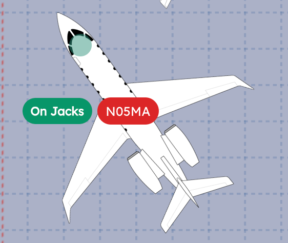
Tags
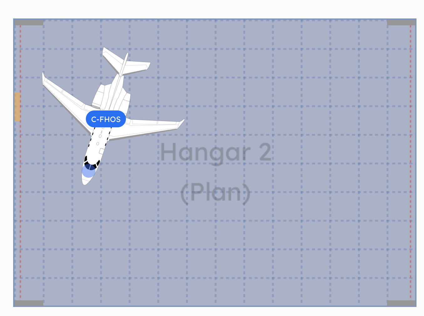
Tags are short labels you attach to aircraft. "On Jacks." "VIP." "MRO." "Fuel Hold." Whatever your team needs to see at a glance.
MRO teams especially love this. Knowing which aircraft are on jacks changes everything about how you plan around them. And tags show up right on the aircraft in the hangar view. No hovering, no clicking into details. The info is just there.
Tags and custom colors working together. "On Jacks" tag, color-coded labels, everything visible without clicking.
Easy to configure. Go to the aircraft, add a tag, done.
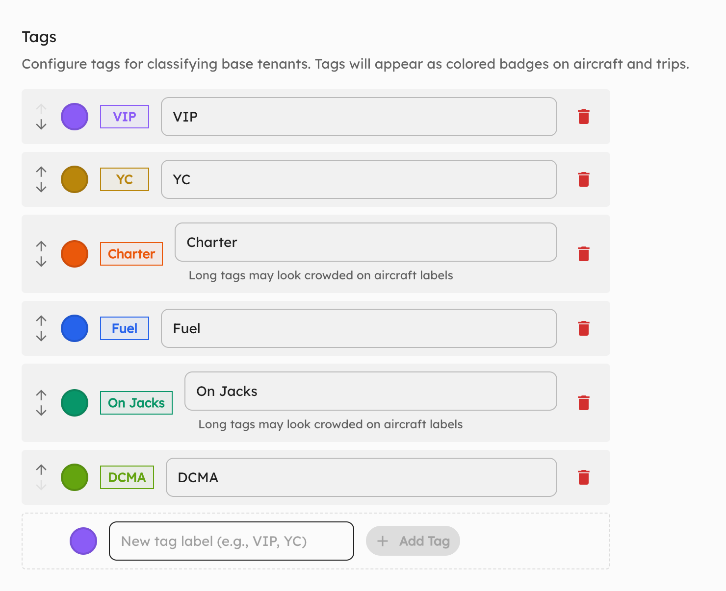 Adding tags is quick. Pick from existing ones or create your own.
Planning for the next generation of aircraft?
AirPlx includes 800+ aircraft models with verified dimensions. Stack your hangar before the aircraft arrives.
See AutoStack in actionCustom Label Colors
A customer asked for this one directly: "Can I color-code my aircraft?" Yes. Now you can.
Blue for tenants. Green for confirmed overnights. Red for departing in the next hour. Orange for "we're still figuring this one out." Whatever system makes sense for your operation.
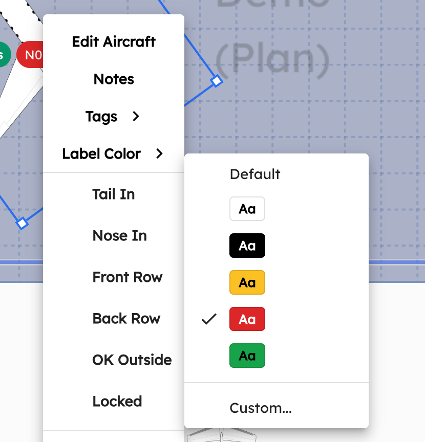 Pick from the presets or go full custom. Your hangar, your colors.
We ship predefined colors for common workflows, but you can also pick any color you want. We don't tell you what blue means. You decide.
Multi-Door Hangars
Not every hangar has one door. Some have two. A few ambitious ones have three.
Previously, AirPlx could only show a single door per hangar. That made towing path planning a bit off for multi-door layouts. If the G650 is leaving at 6am, you want it near the door it's actually going out of, not the one AirPlx thinks is the only option.
Now you can configure multiple doors.
 Two doors, accurately represented. Towing paths and stacking suggestions now account for both.
This affects towing dynamics and how your team thinks about positioning. Small change, big impact on accuracy.
10 New Aircraft
We added ten aircraft this month. The headliner: the T-34C Mentor with wings removed.
 The T-34C Mentor, no wings. Because MRO facilities don't store aircraft in flight configuration.
This one's worth highlighting because it shows something a lot of people don't realize we do: modified airframes. MRO shops deal with aircraft that have wings off, engines pulled, or other components removed. The parking footprint changes completely. If you need a modified airframe for any aircraft, just tell us. We'll build it.
The full list:
- Lockheed C-130J Super Hercules
- Boeing 757-300
- B-29
- Bell 505
- Boeing 747-8
- Stolp Starduster SA-300 Starduster Too
- Czech Aircraft SportCruiser
- Cessna 162 Skycatcher
- Pipistrel Velis Electro
- T-34C Mentor (no wings)
From a WWII bomber to an electric sport plane to a military cargo hauler. We don't discriminate.
As always, if you need an aircraft that's not in the library, email support@airplx.com and we'll add it.
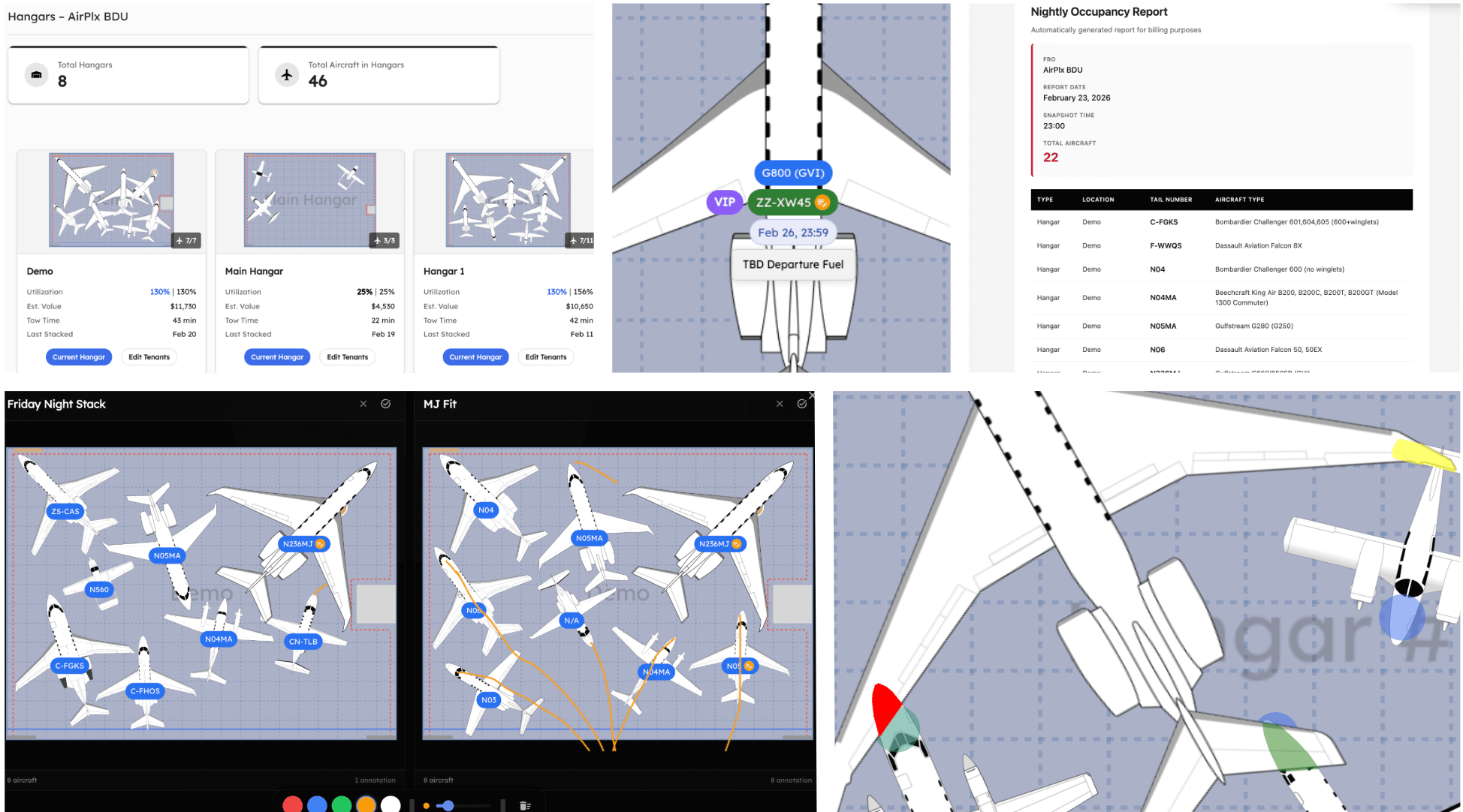
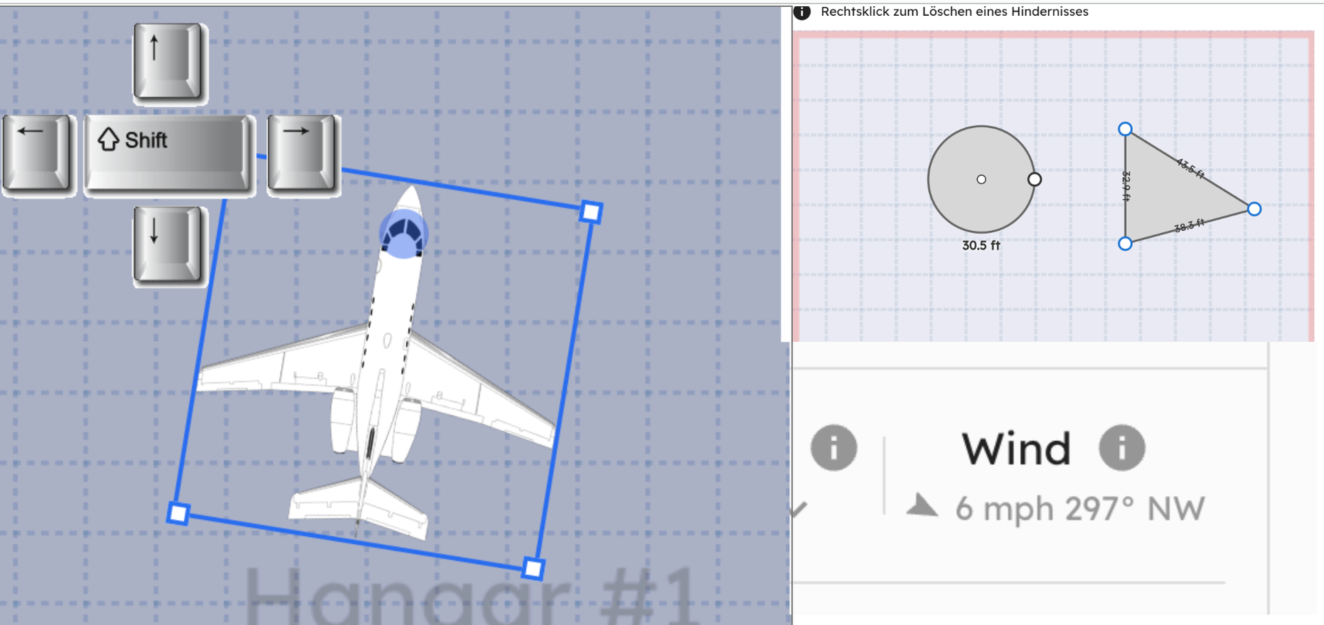
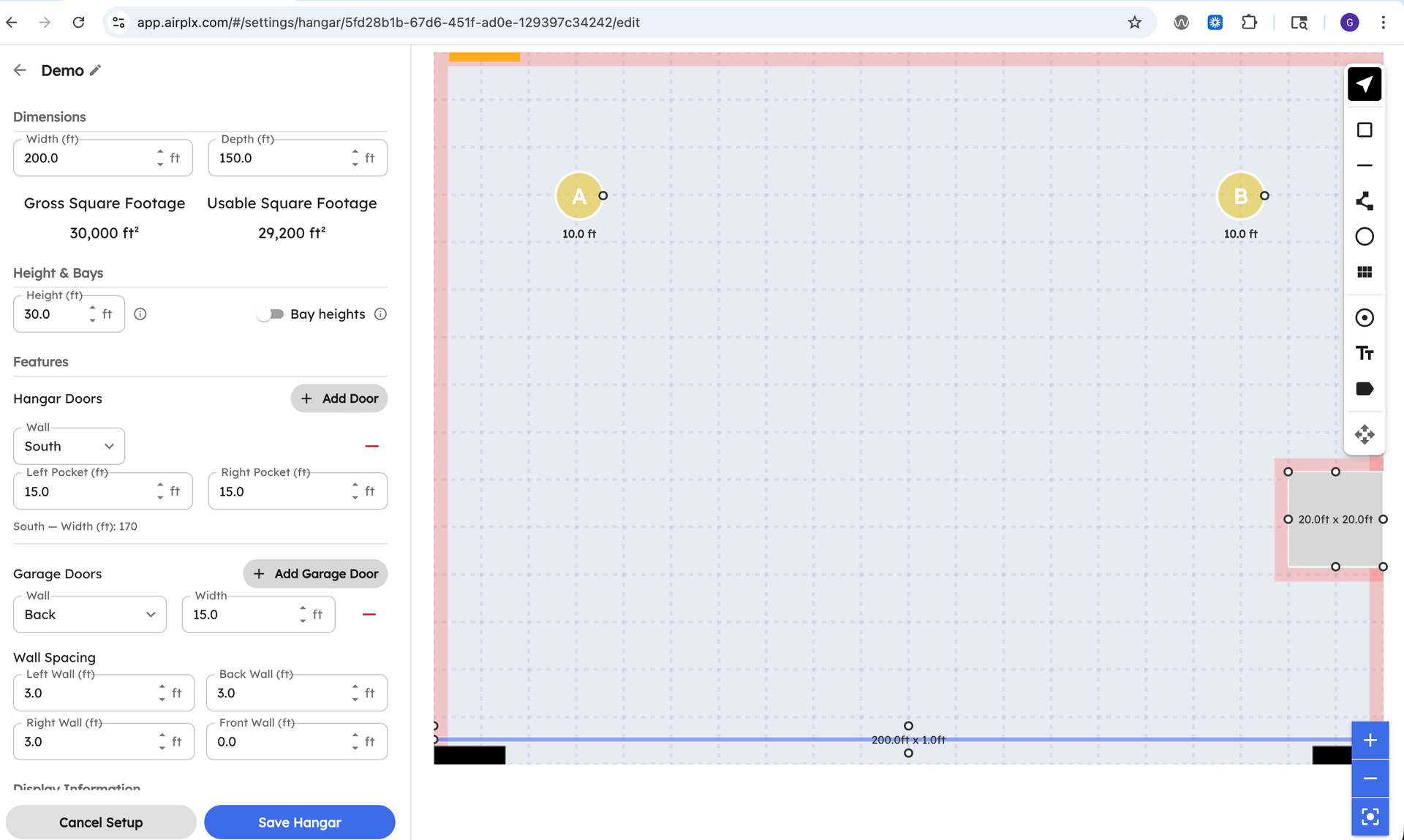
Hangar Editor Improvements
The hangar editor got a serious UX refresh. More objects, more obstacle types, more colors, and a much simpler layout. The editor is now accessible directly from the hangar page, so you don't have to go hunting for it in a settings menu somewhere.
The biggest change? You can now edit your own hangar layout completely on your own. No support ticket needed. Just jump in and start moving things around.
 The new editor. Cleaner, faster, and right where you'd expect it.
 Jump into edit mode straight from the hangar page. No more navigating to a separate settings screen.
If you tried editing your hangar layout six months ago and gave up because it was clunky, give it another shot.
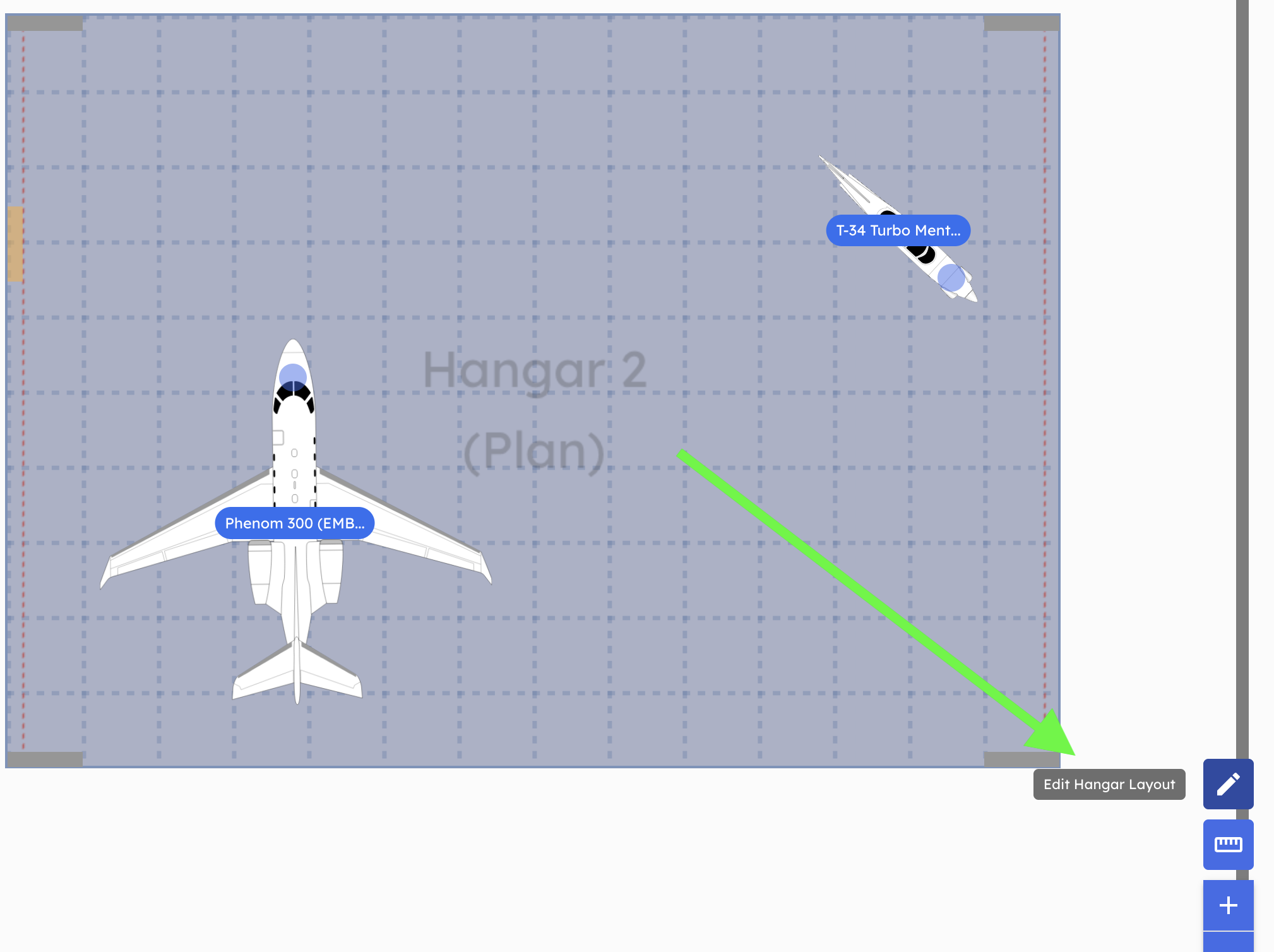
Display Toggles
Three new toggles for controlling what's visible on screen:
Toggle Reference Objects: Show or hide those reference points in the hangar. Great for cleaning up the view before a screenshot or a client presentation.
Toggle Overlap Display: Sometimes overlap is intentional. Scaffolding is supposed to be in the same space as the aircraft. You don't need it screaming red at you. Now you can turn that off.
Toggle Movable Obstacle Labels: You can see it's a tent. You don't need a label telling you it's a tent.
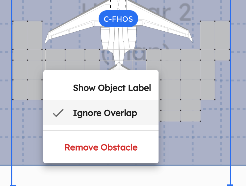 Overlap display off for the scaffolding. Labels hidden on the movable obstacles. Much cleaner.
FlightBridge Integration
If your FBO runs on FlightBridge for trip scheduling, this is a big deal. You no longer need to enter trip details into AirPlx by hand.
Connect the two systems and your trips, aircraft, arrival/departure times, operators, and service requests flow into AirPlx automatically. A trip gets cancelled in FlightBridge? AirPlx knows within minutes. An ETA shifts by two hours? Already updated.
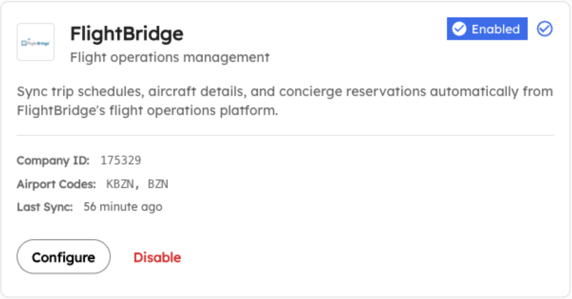 Setting up the FlightBridge integration. Connect once, sync forever.
What syncs over:
- Trips: Tail number, aircraft type, operator, arrival and departure times, trip status
- Aircraft: New tail number comes in? AirPlx checks the registry and creates the aircraft record for you. International tails that can't be auto-matched go to your Operations Inbox for a quick manual review.
- Service Requests: Fuel, hangar, ground services, catering, ground transport, hotel. Each one includes its status, so your ops team can see what's been requested, what's in progress, and what's done.
The way this actually plays out: CSR confirms a trip in FlightBridge. It shows up on the AirPlx schedule. Ops plans it into a hangar. Nobody re-typed anything. Nobody copy-pasted a tail number wrong.
Setup is handled by our team. Reach out to your rep or email support@airplx.com. Full docs: FlightBridge Integration.
FBO One Integration
For FBOs running FBO One, we took a different approach: email parsing.
Here's how it works. A handling request gets created in FBO One. FBO One sends its usual confirmation email. A copy of that email goes to your dedicated AirPlx ingestion address. AirPlx reads the email, pulls out the tail number, aircraft type, operator, and times, and creates the trip on your schedule. Under two minutes, start to finish.
No API keys. No middleware. Just a CC on an email you're already sending.
If you're the person who's been manually re-typing trip details from FBO One emails into another system every morning, this is for you. Full docs: FBO One Email Integration.
Operational Capacity Units (OCU)
This one came from a customer who said something like: "I need a quick pulse on how busy my ramp is. Utilization percentages don't mean anything to me. Just tell me if I can fit another jet."
Fair point.
OCU is a simple metric that answers "how many jets can I fit?" in terms your team already thinks in. One OCU equals the parking footprint of a Challenger 300 (4,400 sq ft). Everything else is relative to that. A CJ3 is 0.5 OCU. A G550 is 2.0. A Global 7500 is 2.6. Think of it like measuring a parking lot in car lengths. "We've got 3.2 OCU left" instantly tells your team whether that incoming Global is going to fit.
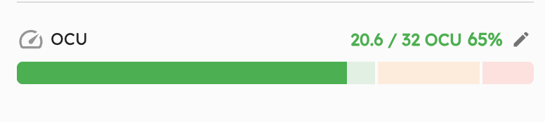 The OCU capacity bar. Green means room to spare. Yellow means think twice. Red means start calling about overflow.
The capacity bar lives in the Ramp Info Card and uses three color zones:
- Green (0-70%): Comfortable. Take more arrivals without sweating.
- Yellow (70-90%): Getting busy. Plan carefully before saying yes to the next one.
- Red (90%+): At the limit. Time to talk overflow options.
Operational capacity defaults to 55% of max theoretical density (because taxi lanes, wingtip clearance, and equipment staging exist). You can override this per ramp if your layout is tighter or more generous.
Enable it in Settings > Configuration > Display. Full docs: Operational Capacity Units.
Mobile and Responsive
We did a pass on mobile and tablet UX across the board. Layouts render better on smaller screens, touch interactions are smoother, and flipping between portrait and landscape doesn't break anything.
For teams using iPads on the ramp or checking layouts on their phone between meetings, this should feel noticeably better.
Sticky Zoom on Ramps
Small one, but people keep thanking us for it. AirPlx now remembers your last zoom level on each ramp. Switch away, come back, and your zoom is right where you left it.
There's also a shortcut button to snap back to the default view when you need it.
Bug Fixes
- Favorites performance: We added canvas rendering for the favorites panel. If you had 20+ saved layouts and noticed lag when opening the panel, that's gone now.
- Overlap display accuracy: Collision detection was working correctly, but the overlap display was occasionally showing red when it should have been yellow or green. Fixed. Colors now match the actual severity.
- Misc stability improvements: Various fixes from customer reports. If you reported something and it's working now, thank you. Keep them coming.
What's Next
We're expanding the integration library. FlightBridge and FBO One are just the start. If you use a different scheduling or FBO management system, tell us which one. We want to know what your team runs on so we can kill more manual data entry.
OCU is the foundation for smarter capacity planning. We're working on forecasting that combines OCU with your schedule to predict capacity crunches before they happen. No more "surprise, three Globals just called in and you have room for one."
As always, the roadmap is shaped by what you tell us. Email us at hi@airplx.com.
Want to see these features in action? Schedule a quick demo or email us: hi@airplx.com